A wall painting at a Sp?ti near you — or: how I made fifty bucks in three days, but at least I got to keep the leftover paint.

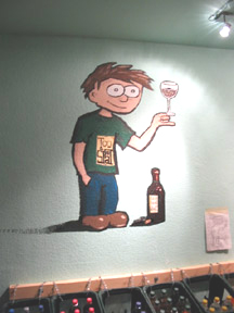
Wineglass: nice subtle realistic shadowing, but having used a glossy red, it just looks sparkly and brow.
Hand: Humanistic, but two fold on the wrist are anatomically rediculous. Minus 2.

Bottle: Almost realistic, rich coloring of bottle. Shadowing: A little out of hand. Minus 1.

Too Spaet Logo: Clever. But end design of lettering was completely improved. Looks sloppy. Minus one. Boo.

Head: acheived desired look of affable discomfort. But what’s up with that shadow inside the ear? Hair: highlights and shadows disagree. Minus 2.

Signature: Classy and subtle. But misaligned somewhat with shadow. Minus 1.

Shoes: Awkward, inward-turned shoes, a serendipidous almost Crumb-ish effect. But the sheen on the right foot askew. Nice pants, though. Minus 1.

Shirt: Nice green color. But in Jr High, if you wear green on Tuesday that means you are gay. The folds under the armpits make no sense. And: What’s the deal with that shadow up by the colar? Minus 2.

Torsten, sole proprietor of Sp?tschict, publisher and patron of the arts.
This entry was posted
on Saturday, October 23rd, 2004 at 9:57 pm and is filed under Uncategorized.
You can follow any responses to this entry through the RSS 2.0 feed.
Both comments and pings are currently closed.